Color matching has many inherent challenges. There is the visual: what the eye sees; there is CYMK: the traditional four color process used in printing; there is RBG: what a monitor shows you; and finally there is Pantone: the measurable system we use in print and other media to dictate exact color matching. The printing process has its own unique limitations, as we can’t actually create everything that the eye sees.
Color is basically a reflection of light. When we are printing color, we are printing it on white paper (sometimes also with a primer) and whether you realize it or not, you can see the white through the color. Sometimes we are faced with a color that falls into area that we can’t match in printing. In this instance, we might present 10 tones that we are capable of printing and have our designer pick the tones that match the best.
What colors you see on a monitor are very different than the color that will be produced by a printer. Because of this, we provide a printed color match sheet (see the example below).
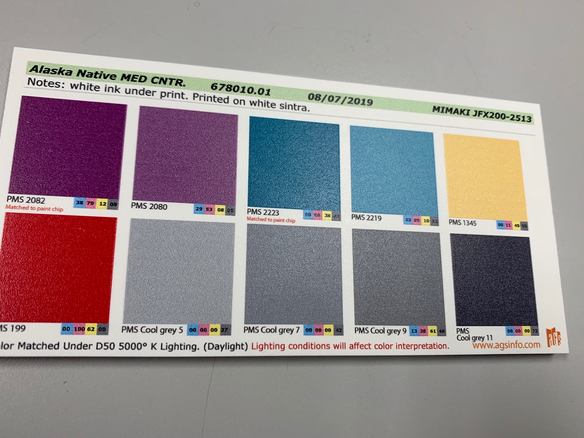
Different lighting conditions can influence color appearance. AGS matches colors under 5,000k lighting. This is the most common lighting and typically can be seen by taking your color proof and looking at it outside under natural light.
We also provide a Pantone lighting indicator. This shows how lighting temperatures can affect the visual appearance.
When we follow these methodologies with our designers, we have a more successful approval rating and a closer color match from the visual, to the monitor, to the finished product.